Case Study: Te Creemos & HEDERA
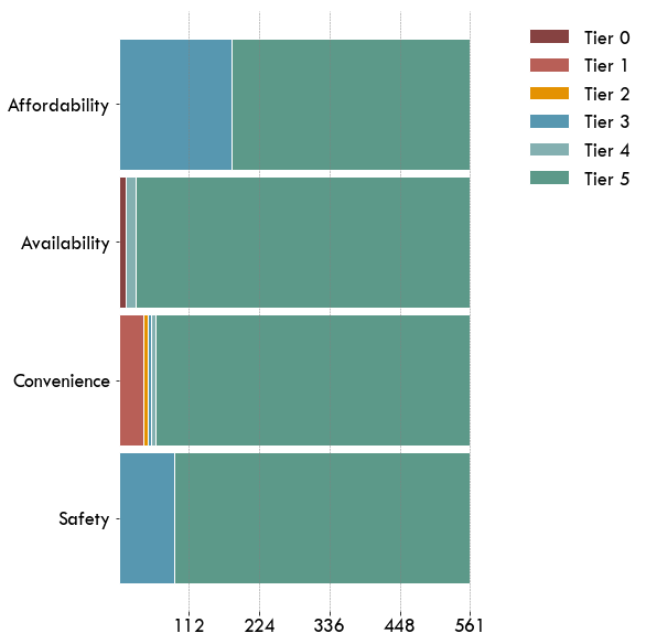
Energy access is multidimensional. In order to quantify and address energy demand and energy needs of the rural population, it is highly necessary to implement tools that are not limited to a purely binary assessment (household connected/not connected to the grid). Assessing energy needs shall take into account a wider range of attributes, measuring energy access in terms of affordability, reliability, quality, and safety of energy, as well as include the possibility of using modern and alternative sources (e.g., solar home systems, mini-grids).
The purpose of this pilot study was to
- Analyze the access to energy of a sample of clients of the Mexican microfinance institution Te Creemos
- Collect a large amount of household data within few weeks
- Perform energy access assessment according to the Multi-Tier Framework (MTF) developed by the ESMAP sector of The World Bank.
Data collection, analysis and visualization has been implemented with the HEDERA Impact Toolkit Software. Relevant information concerning the use, associated costs and several attributes describing access to electricity and cooking solutions has been collected the customers of the financial institution in rural and remote areas using the App HEDERA collect.
The sample - and the evaluation of the energy access attributes - allows also to evaluate a baseline with respect to SDG7: Affordable, reliable, and safe energy for all. The case study is also a pioneer application of the Progress out of Energy Poverty Index (PEPI), which is also based on the MTF.
Methodology
Household data can be efficiently collected using the mobile survey integrated in HEDERA collect. The survey optimizes the ESMAP Energy Survey based on the Multi-tier framework, and can be efficiently completed in less than 15 minutes.
The HEDERA staff trained for the installation the head of the IT department of Te Creemos. As next, the IT department installed the required App remotely in the mobile phone of about 100loan officers (in 82 different offices of the instittion), and trained the users.
Collection overview
Map
The Map allows to visualize the location of the collected GPS data. Missing data points are displayed with coordinated (0,0)
Data per location
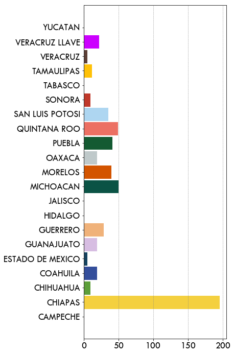
Data have been collected in more than 80 offices of the institution, covering all departments of Mexico. The following figure shows the amount of surveys in the different offices of the institution.
Dates of Collection
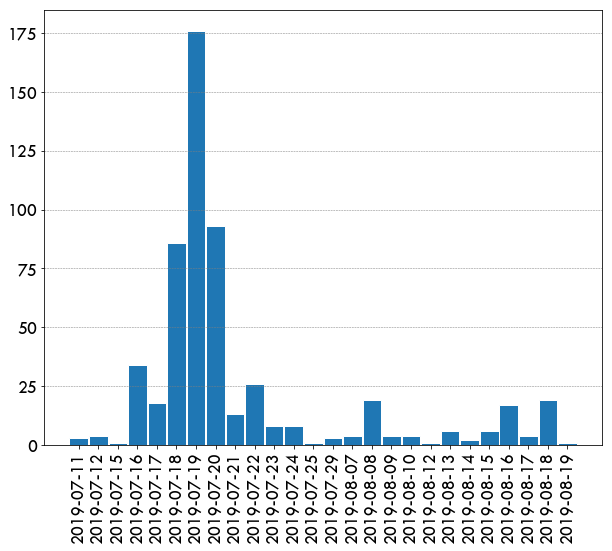
The following figure shows the amount of surveys per day
Average Duration
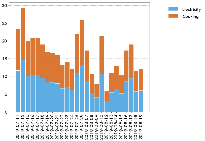
Surveys duration was on average between 3 and 15 minutes (for electricity and cooking)
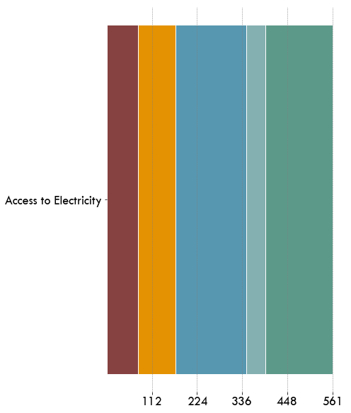
Access to Electricity
Attributes
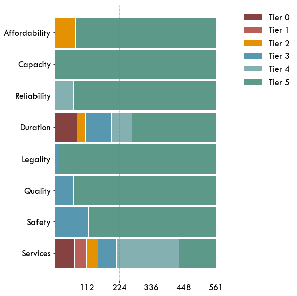
MTF Index (Access to electricity)
The MTF Index is given, for each household, by the minimum ranking among all considered attributes.
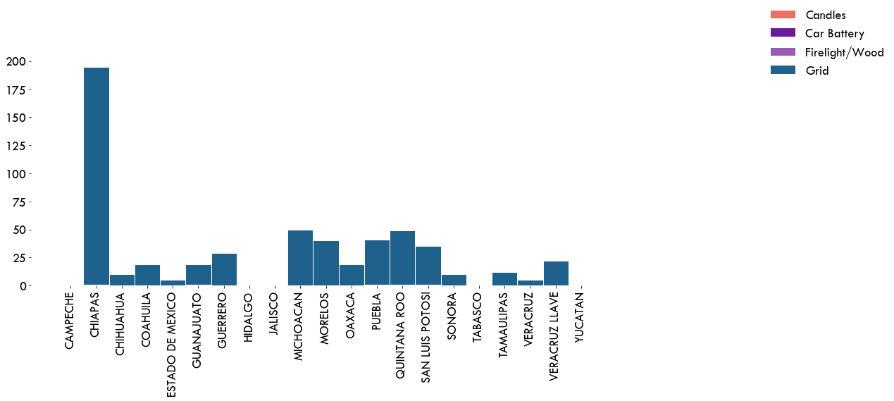
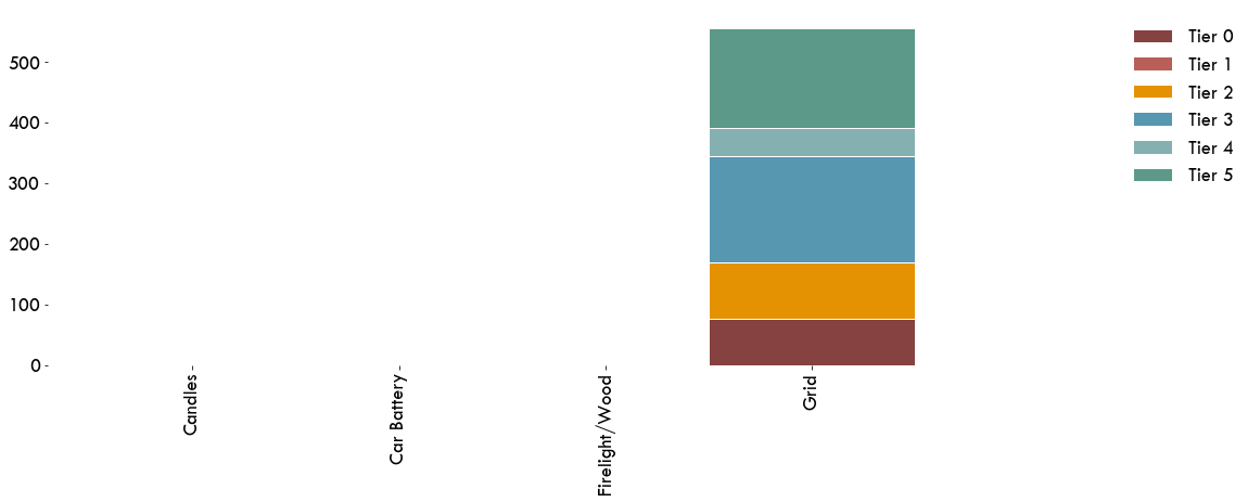
Power Sources
Primary Sources of Electricity and Illumination
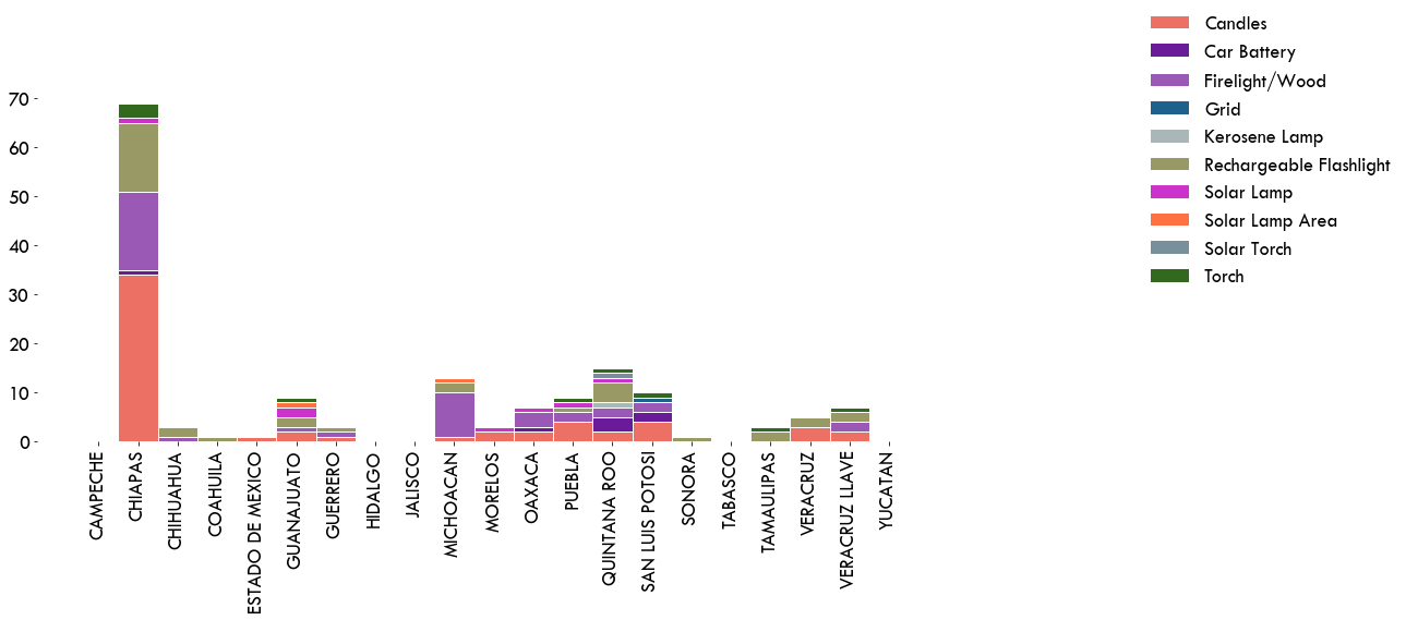
Secondary Sources of Electricity and Illumination
MTF Electricity Index vs. Primary Source
Access to Cooking Solutions
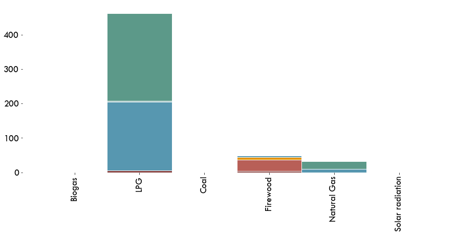
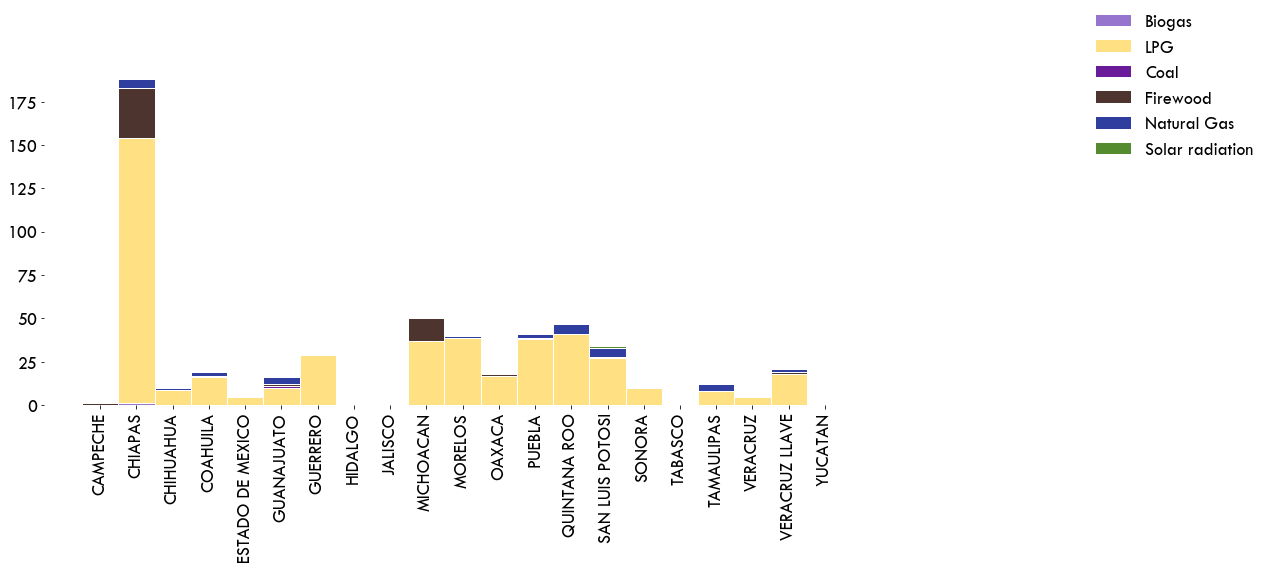
Primary Cooking Fuels
Attributed describing access to cooking solutions
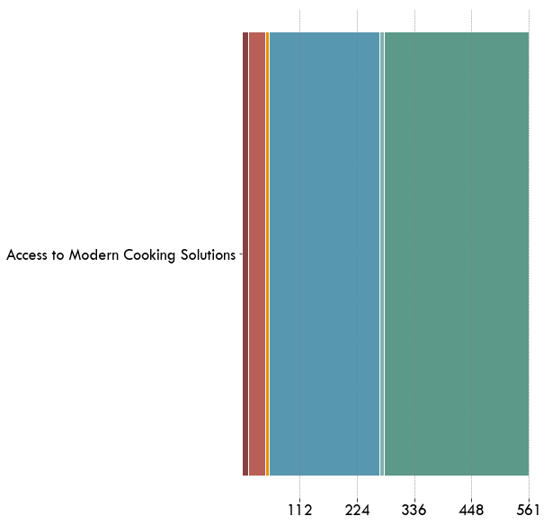
MTF Index (Cooking solutions)
The MTF Index, for each household, is given by the minimum ranking among all attributes
MTF Index (Access to Cooking Solutions) vs. Primary Cooking Fuel